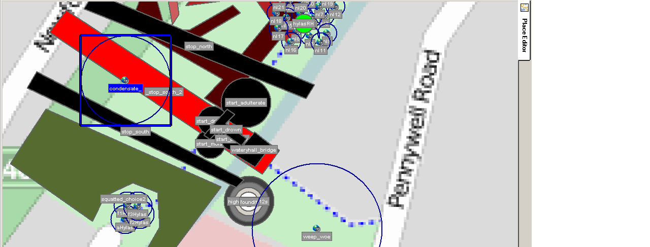


THEMES: hylas bodybuilding, revenge (drown him), regret and closing
twilight (weepsWeepingWoe & do we want to inhabit?)
TECH:
-testing odd-shaped-music-regions that gradually accumilate (i.e
no stop-on-exit) along with boundary regions that silence the
accumilated layers
-testing similar concepts with spoken word - building intensity (drown
him) until the deed is done
- testing clusters of repeating short phrases, along with a single
contrasting phrase in the centre
-testing audioclip logic "if they've not heard this yet, then play them
this" - using a glitchy version and a clean version of a spoken
passage
-testing gradually accumilating rising tones on the tump in the corner
("we found it!" clip when you reach the top)
Jubilee Park Mediascape Testing -28th April

Phill and I have been creating/testing a Mediascape on Jubilee Park in Chipping Sodbury. Well, we built it for the park and then transposed it all to Queen Square in Bristol for testing. But maybe a trip to Chipping Sodbury next week? Phill had preselected audio clips for us to play around with. Starting with the music... you can see below that the music was placed in overlapping blocks across the entire area. First this layer...

Then a second layer on top.......

The music was given hard edges rather than fades..and that seemed to work well. It helped to reinforce the feeling that the users movements were triggering new experiences. The music works well when its blanketted across the area like this, but we also think that in future we might experiment with making it more focused (using small speaker areas) so that it interacts with the words more, rather than always forming a bed.
Phill had broken-down the 'Nuts' peice into individual 'nuts'. So, in keeping with our last test where the experience became more interesting, more interactive where the poetry was fragmented into clusters of short sounds, we placed these along the path through the park, and also along the river bank. These have been looped and then a fade effect applied so that audio from Ralph appears in one channel (say left earphone) and from Katie in the other -to produce a kind of stereo effect. As you can see here, it produces a pretty intense experience!

The 'stereo corridor' worked really well -but we felt it was too cluttered to have this device along the riverbank as well and so (as you can see in these diagrams) we instead moved all the 'clutter' to group it along the path, leaving some space along the riverbank to let the music do its work. Into this we also added a 2 minute sequence of words, all alone, down by the river bank. It seems to work much better, we found, when there are distinct areas of intensity and others which are more contemplative. Contrast helps give more definition and lends itself to different kinds of moods.
Over to the east side is Brook Street, which leads over a bridge to the entrance to the park Across this we placed a series of speakers which play the same audio -but with the pitch increasing as you approach the park entrance. This seemed to nicely lead you into the experience -like a series of arrows pointing the way in.
(see the top image)
Also, we placed a band of music that reminded us of a burbling river over the whole river (in dark red). With headphones on, people will lose the natural sounds of the river, and so this is a way of reintroducing the sounds of a river, or enhancing them.
Now over to the west side of the park, we tried a few more things here....

First, we placed a longer loop of poetry (about 2 minutes) on the footbridge (bottom left). We noticed on our site visit that people would stop on the bridge to look down at the river, chuck stciks and so on. It makes sense to capitalise on places where people linger to play longer form material.
Second, we experimented in the blue area with dipping the music to bring out the words (in the speaker areas).
And lastly, in the orange and cream music areas, again either side of the path, we placed different versions of the 'forget-me-not' readings -which worked nicely.
All in all, a useful experiment -with lots learnt. But looking forward to Ralph and Marc's input. There are just so many ways the material can be configured! It's all a bit mind-boggling!
Notes on ‘Frome Maidens’ testing, 8thApril 2010
Phill and I mapped out in Mediascape some test-runs, using samples from the music and poetry recordings, and then ventured out on foot to see how they worked. Having discussed whether we should try to ‘theme’ the audio recordings, we eventually opted to pick the samples at random. This would show whether the material worked together in the way in which it was designed, i.e. interchangeably. One thing we were keen to find out was some kind of scale for the project: how close or far apart should we place the ‘objects’; how wide their areas; how much overlap? Too close might produce polyphonic chaos, with too much information at once. Too sparse might produce lulls in information, or even gaps. We figured that the size of a ‘sound area’ must be linked to its duration and some idea of how users might walk through it (fast or slow, in straight lines or meandering).
Test 1

In the first test, we used larger areas of music (one for each corner of the square) and then superimposed a series of smaller areas of poetry on top of this. We also included a long ‘corridor’ of poetry along a path crossing the square. The good news is that, however you place them, the music and poetry do work together –at least to the extent that they don’t clash but seem to complement each other.
The ‘corridor’ turned out not to be on the path, so this raises some questions about how small and defined an area can be. But, it might be possible to fix this by realigning the map-which Phill is going look into.
It turned out that in this configuration, the audio ‘clips’ were too sparse. As we wandered around, we were listening to the same things for too long. Where the poetry was looped, it became repetitive. Where it wasn’t, you were left listening to the music alone for too long. (I think also, we mistakenly fell into the trap of thinking of the music as a bed for the poetry!) Also, because the ‘areas’ had been quite randomly placed, and not tied-in to the landscape (except for the ‘corridor’ which, in any case, didn’t match the path) the experience became a bit confusing and frustrating. I wanted to be able to exert some control over what I was experiencing by moving in and out of areas but couldn’t fix the areas in my mind or tie them to the landscape I was in. It ceased to engage because it didn’t feel interactive but almost random. If we think of Queen’s Square as being the ‘interface’, in much the same way as computer screen, then I was clicking and nothing was happening! This wasn’t helped by ‘soft’ edges to the areas produced by long ‘fades’.
Test 2

Taking these observations on board, we designed a second test to see if we could address some of these concerns. First, this involved fixing a smaller, distinct area of sound (with no ‘fade’ at its edge) to a patch of grass delineated by paths on all sides. In other words, it was tied to the landscape. Then around five short poetry clips were placed as speakers in this area. The experience was far richer and more satisfying, putting the user in greater control: By taking 10 paces or so in a new direction, we were able to elicit new sounds and by retracing our steps we could double check the location or source of sounds. There seems to be something instinctive about wanting to produce a mental map of the sounds. Superimposing the sounds on objects or areas in the landscape aids this process. Making sound areas quite distinct takes away the confusion felt when sounds don’t have discernable edges but morph into each other. Keeping audio clips short and packing them more densely allows you to heighten the sense of interactivity; one suggestion would be that the poetry recordings could, at least in places, be broken down, line by line, and packed into dense clusters.
On the edge of the area we used for this experiment was a park bench - which sparked another idea; that places where people might linger could be used to play fuller versions of the music/poetry which is broken-down into components in adjoining areas.
A second experiment was to place bands of sounds across one of the paths, so that walking along the path triggered a sequence of sounds. It’s one way you might achieve some linear progression of words or music; if that’s desirable. We had three bands of very short poetry clips, which was a little too sparse, but still it made for an ‘easy’ experience because we were taking the sounds to the path of the user rather than requiring them to wander around in search of them. I know we are avoiding linear approaches, but there may be some merit in making some easy inroads to the experience, and then encouraging users to branch off into more demanding explorations.
Phill suggested that these bands might work better if they were overlapped in such a way as to be cumulative –with sounds being progressively added along the path, building to a crescendo. This could also be used to lead people (like a game of ‘hotter’/’colder’) to some specific object –physical or aural. At the end of the path, at centre of the square (where there is a statue), we had placed a soundbite and there was some pleasure to be had in ‘discovering’ this –like a hidden pot of gold!
Finally, we had created a border around the active area of our experiment to trigger a looped ‘Ooops!’. This was initially for our benefit because we wanted to make it easier to locate our experimental areas and not waste time trudging around the square –but proved to be really useful and points to a need to build in some navigational clues; at the very least, a boundary which marks the edge of the experience. This could even be in the form of a ‘welcome’ on arrival and ‘goodbye’ on departure. Once again, it helps to fix a mental map.
For me, these experiments were really revealing. The lack of a linear narrative isn’t a problem: the music and words do work really well together and can produce really rich and enjoyable experiences. But there does appear to be a need to tightly structure and order the experience in spatial terms. As an old-fashioned linear documentary-maker, I’ve recently been looking into interactive web-documentaries and trying to get my head around this very new way of thinking and working. There are some parallels in that when the relationship between images or clips can’t be controlled sequentially, sense is made only by their careful spatial arrangement (spatial montage instead of linear montage). At least with a web-documentary you have the clearly visible structure of the interface (the screen) and the hyperlinks contained within it. With this project, the interface isn’t there in front of you all at once but only experienced moment by moment. For me, this suggests that in order to make the experience comprehensible and put the user in control, the sound landscape needs to either somehow mirror the physical landscape so that the landscape becomes the visible interface or at least to have a shape that can be easily imagined as a mental map. And just like a website or web-doco, navigation will also be helped by clear signposting.